DID POOR USER-EXPERIENCE DESIGN CAUSE THE FALSE ALARM IN HAWAII?
Hawaiian officials have much to consider as they draft new safeguards on emergency management systems in response to the missile scare. The Hawaii Emergency Management Agency (HEMA) assures a full analysis will bring forth a better process, and the employee responsible for clicking the wrong button has been reassigned.
But, was the false alarm truly a problem of human-error or could the problem have been caused by poor user-experience (UX) design?
‘THIS IS NOT A DRILL’
On January 13th at 8 a.m,, Hawaiian residents and tourists were notified of an incoming missile and urged to seek shelter. The missile alert was broadcast over television stations and mobile phones throughout the island, which led to immediate panic all across Hawaii. Folks scrambled to safety and looked to state officials for answers. Unfortunately, a second alert proclaiming the initial missile alert as a false alarm did not reach panicked citizens for approximately 38 minutes.
https://twitter.com/TulsiGabbard/status/952243723525677056
USER-ERROR OR UX DESIGN ERROR?
Shortly after the false alarm in a televised press conference, State Officials declared the mistake was caused by human error during a shift-change drill.
“It was a procedure that occurs at the change of shift where they go through to make sure that the system, that it’s working. And an employee pushed the wrong button.” – Gov. David Ige
However, the public demanded answers as to how and why the false alarm occurred and the need for swift accountability.
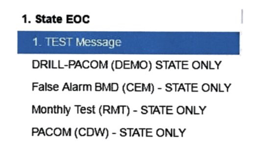
On Tuesday, HEMA shared an image that represented an interface that the employee would have interacted with during the shift-change drill. Needless to say, many found the UI/UX design to be crude and confusing for such an important task.

THE BLAME GAME
Though the operator may still be at fault for the release of an accidental missile alert, the blame should also be shared with the designers (or absence of a designer) which led to a faulty interface design. As with many systems, the user-experience demands satisfying usability, accessibility, and effortless interaction.
The ability to design enjoyable UX/UI encounters for consumers of various technologies is an enormous value to any company. As Artificial Intelligence (AI) and machine learning continues to flourish, it’s never been more important to stitch the gap between human and computer interactions.
Found this article interesting, don’t forget to share with friends! For more information, visit our blog and stay current with the latest news!

